In the tribune Zone Expos
The New Expos
19 sept. 2026 · 344 vues
What if, just for fun, we imagined what Expos created today might look like? A concept by VEC Collective takes the exercise far beyond a simple new logo: visual identity, typography, uniforms, Montreal symbols and even stadium environment.
First and foremost, let's be clear about something: the historical visual identity of the Expos is excellent.
The famous "eMb" logo, the blue, white and red colours, the cap and uniforms are an integral part of the team's history. More than two decades after the Expos' last game in Montreal, this identity remains immediately recognizable and deeply associated with Montreal baseball.
If the Expos ever returned, it would be entirely natural for this identity to return as well. And the objective here is certainly not to suggest it should be replaced.
But on Zone Expo, we also love to explore ideas and have fun with possibilities.
It's in exactly this spirit that a concept by VEC Collective was shared with us. Titled The New Expos, the document is presented as a speculative study of brand identity and uniforms. Its creator deliberately chose to impose a rather radical constraint: rather than simply modernizing the Expos we know, they asked themselves what their identity could become if a new franchise decided to open a new chapter.
The result is a complete creative exercise that we present to you here.
Not recreating 2004
The thinking behind the project is probably the most important part to understanding everything that follows.
For VEC Collective, a potential return of the Expos shouldn't necessarily take the form of an exact recreation of the team that left Montreal in 2004. A new franchise could retain the emotional power of the name Expos, while developing an identity representing today's Montreal.
To justify this approach, the concept goes back to the very origin of the name.
The Expos were named in reference to Expo 67, that international exposition which presented Montreal as an ambitious, architectural, inventive city looking toward the future.
That's where the true thesis of the project comes from:
The original Expos were named after an exposition that showed the future to the world. New Expos should do the same.
From there, the creator establishes their direction: honour the old franchise without imitating it, draw from Expo 67 and Montreal modernism, create a symbol strong enough to stand alone, and build an identity that could sit alongside current MLB franchises.
A new "e" rather than an evolution of the eMb
The most dramatic change is obviously the main symbol.
Rather than attempting a new interpretation of the famous eMb logo, VEC Collective proposes starting fresh with a completely different symbol: a lowercase "e" with large curves, primarily navy blue, with a red movement in its lower portion.
And this simplicity is intentional.
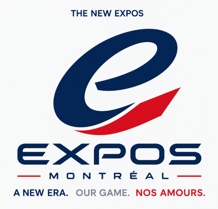
The creator didn't want this new symbol to try to tell Montreal's entire story by itself. So there is deliberately no M, no fleur-de-lis, no baseball, no Montreal landmark directly integrated into the main logo.
The principle is rather that Montreal expresses itself through the entire identity.
The large blue curve should create movement and continuity, while the lower red stroke adds an impression of acceleration. The negative space allows the symbol to remain relatively light despite its imposing shape.
The creator also sees a subtle echo in the large forms of Montreal modernism, notably those associated with the Olympic Stadium, without transforming the logo into a literal illustration of the stadium.
Above all, this "e" was designed for where a baseball logo should probably be most effective: on a cap, at small size, without needing the word Expos to be recognizable.
Expo 67 all the way to the typography
The concept becomes particularly interesting when you move beyond the logo.
The typography developed for EXPOS and MONTRÉAL is directly part of the thinking around Expo 67.
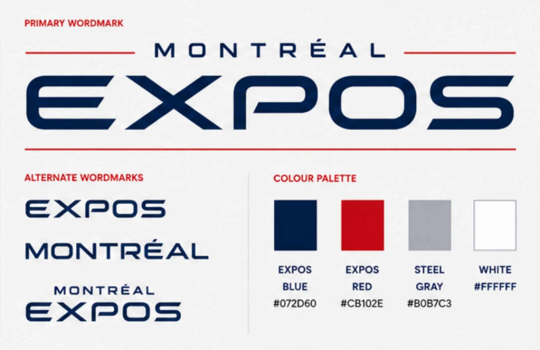
Its geometric and elongated forms aim to recall the graphic design of the expositions, the signage of pavilions, the architecture and that modernist optimism associated with Expo 67.
This direction doesn't stop at the team's name.
Player names use the same graphic language, as do the numbers. The objective is for a uniform to be identifiable to this new identity whether viewed from the front or the back.
Even the way EXPOS is written is deliberately deliberate: the concept favours large capital letters and avoids a retro approach that would artificially try to recreate another era.
References to Montreal are still there
The absence of Montreal symbols in the main logo certainly doesn't mean they disappear.
The creator prefers to give them distinct roles.
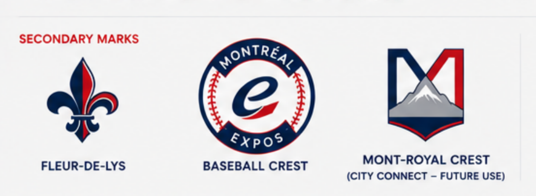
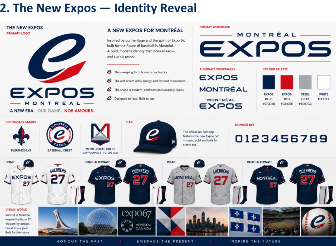
A circular crest places the new "e" at the centre of a ball with the words Montreal and Expos. This becomes the secondary symbol more directly associated with baseball.
A fleur-de-lis constitutes another autonomous element representing more the city and culture.
Finally, a third emblem combines architecture shaped like an M with a reference to Mount Royal. This is deliberately set aside in the main concept so it could potentially serve as a base for a City Connect identity.
The hierarchy imagined is therefore very precise: the "e" represents the Expos, the crest represents the club in its baseball universe, the fleur-de-lis represents the place and culture, and Mount Royal opens the door to an alternative Montreal identity.
A cap deliberately very simple
On the field, the centerpiece remains the cap.
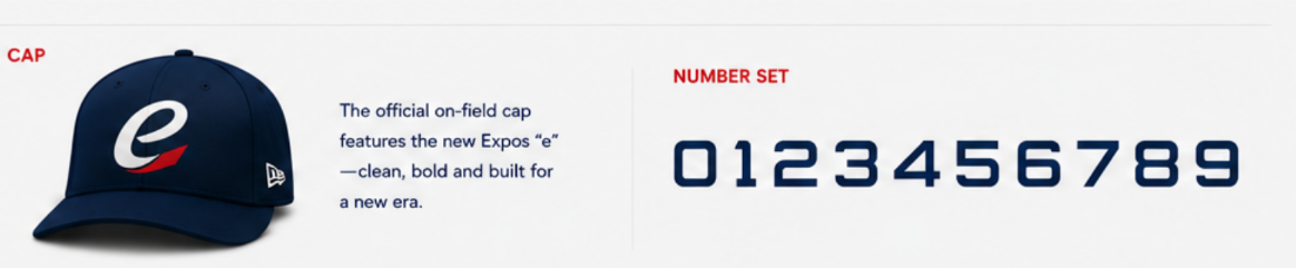
VEC Collective proposes an extremely simple navy blue cap with only the new "e" on the front.
Here again, the creator favours repetition over multiplying symbols: according to the project's logic, a franchise identity becomes stronger when the same symbol is used constantly.
The palette nonetheless maintains an obvious link to history: Expos blue, Expos red, white and steel grey. Navy blue becomes the dominant colour, red brings energy and grey serves notably as a contemporary base for away uniforms.
Four uniforms to build a coherent identity
The same restraint is found in the uniforms.
Rather than multiplying variations, the project limits itself to four combinations.

At home, the primary uniform is white with EXPOS on the chest. A navy blue version with white pants serves as an alternate uniform.
On the road, the team would wear a steel grey uniform displaying MONTRÉAL, accompanied by an alternate navy blue version with grey pants.
One detail particularly sums up the creator's philosophy: they deliberately avoid faux-historical cream-coloured uniforms and treatments designed solely to evoke the past.
In their scenario, the goal is not to manufacture nostalgia.
The goal is to imagine what the Expos would look like now.
A visual universe inspired by Montreal
The identity then goes far beyond the field.

Expo 67, the Biosphere, the Olympic Stadium, Montreal architecture, civic symbols and contemporary images of the city make up the proposed visual universe.
The project summarizes this direction in a few ideas: rooted in Montreal, inspired by Expo 67, modern by design, proud of the past and built for the future.
This is probably where we best understand that the exercise doesn't really try to erase the history of the Expos.
It rather tries to push nostalgia into the background to ask: what would Montreal want to show the world today?
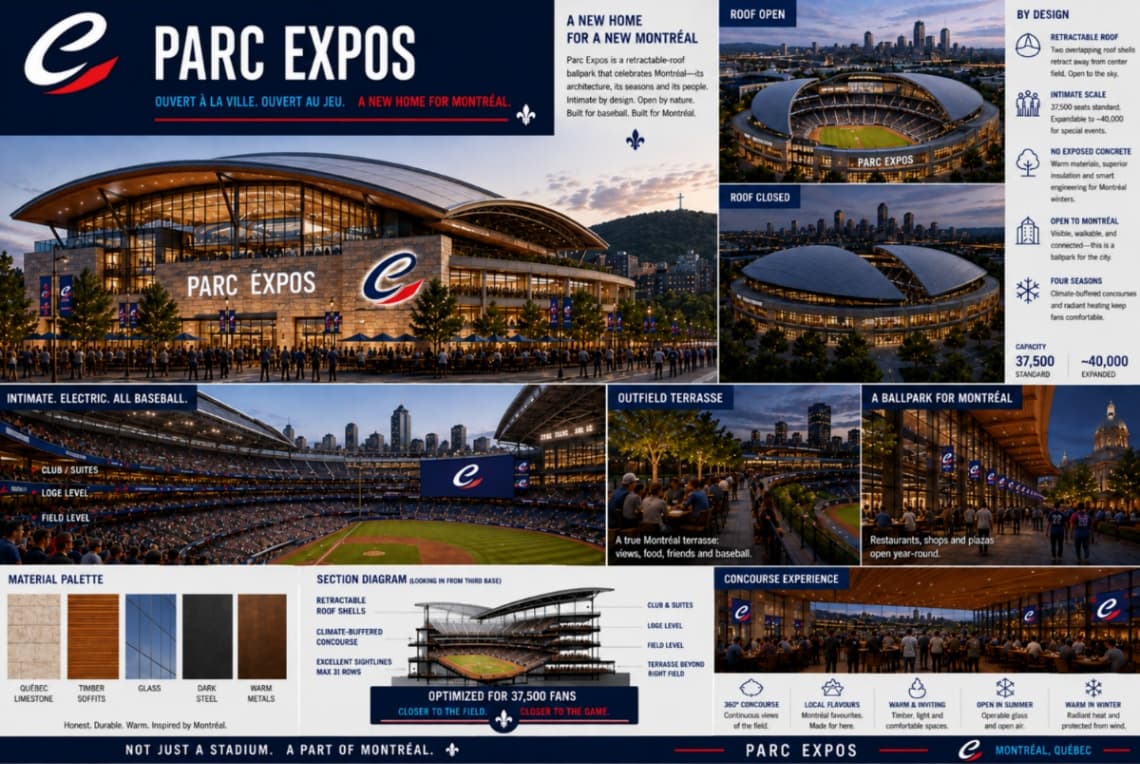
And even a Parc Expos
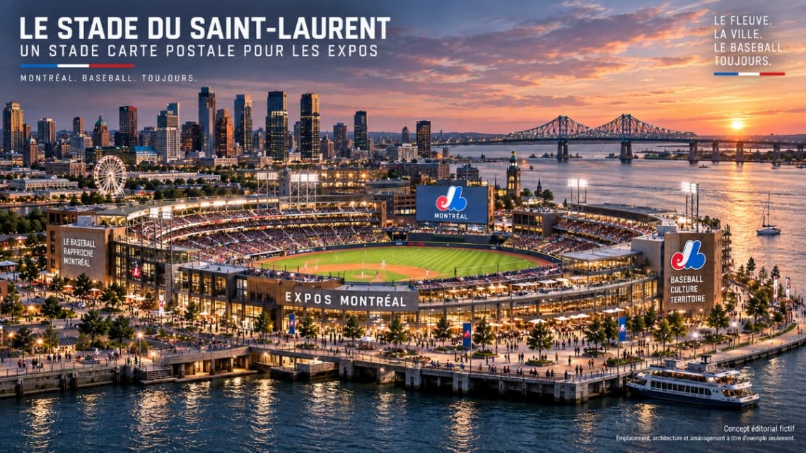
VEC Collective ultimately pushes its universe to the stadium with Parc Expos.
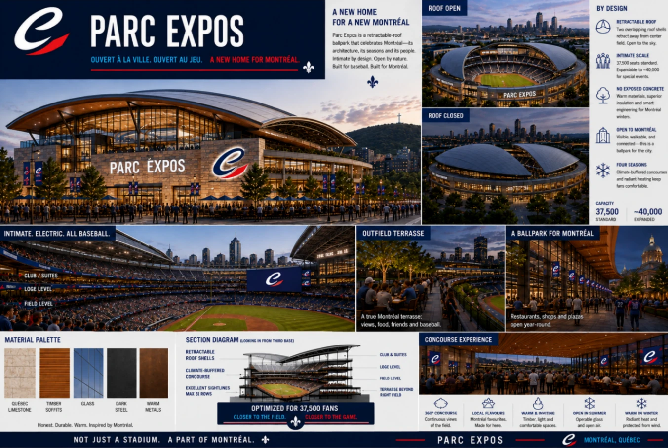
Again, this is absolutely not a real stadium project. The creator makes this clear themselves: Parc Expos is a speculative extension of the brand universe and not an architectural or real estate proposal.
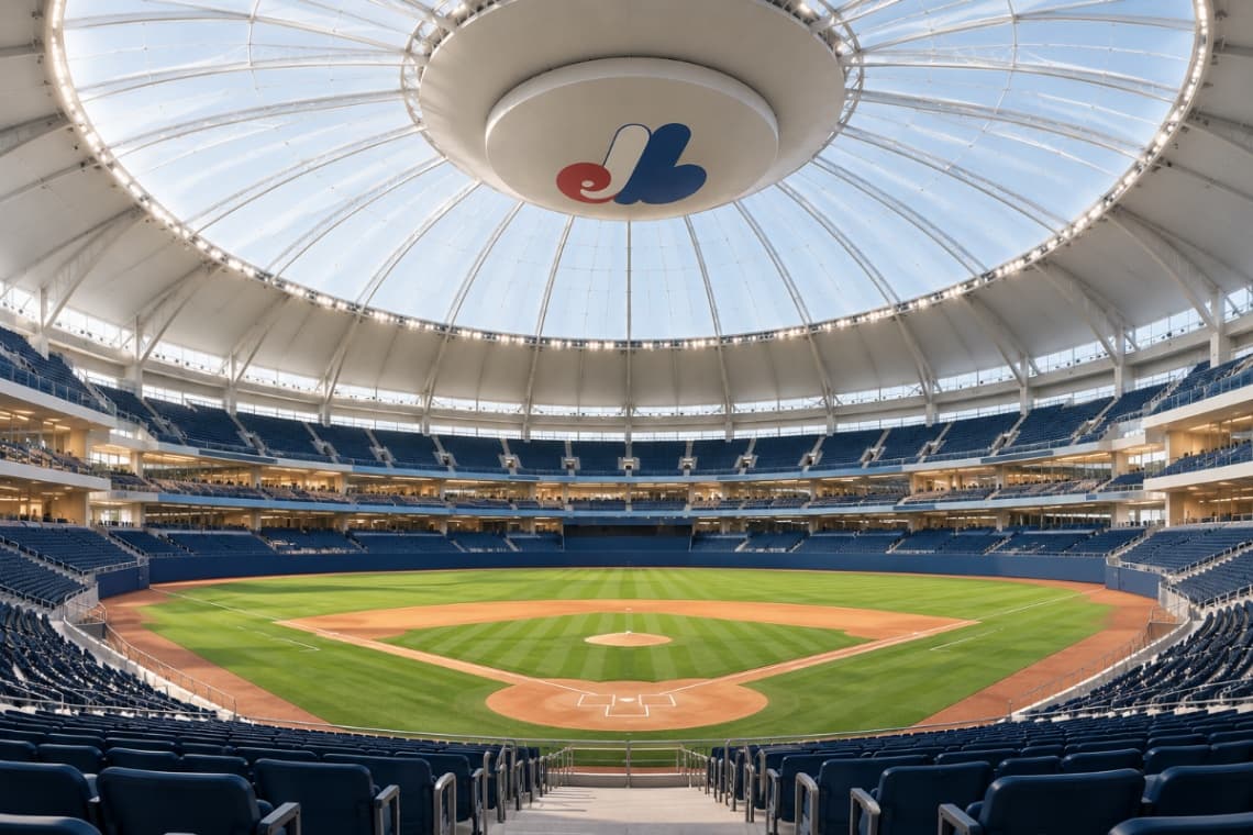
The concept nonetheless imagines a retractable-roof stadium, relatively intimate, designed to function year-round and be more connected to the city.
It's a way of pushing the exercise to its conclusion: if this new identity really existed, what environment would it live in?
A new era... just for the fun of imagining it
The project's conclusion ultimately sums up the entire approach very well.
For VEC Collective, the strength of the name Expos isn't limited to nostalgia. It also represents a certain idea of Montreal: a city open to the world, confident in design and optimistic about what comes next.
So their concept keeps the name, the colours, Montreal pride and affection for Our Loves, but gives this imaginary franchise the chance to create its own symbol, its own typography and its own era.
And that's probably the best way to look at this project.
Not as a proposal aiming to replace the Expos' classic identity.
That identity already exists, it's excellent, it remains deeply loved and it would obviously be very difficult to replace.
But nothing stops us from taking a blank page sometimes and asking ourselves: "What if?"
That's what VEC Collective did with The New Expos. And while we wait to see if major league baseball will really return to Montreal one day, this is exactly the kind of exercise we love to present on Zone Expo: fan ideas, concepts, different visions and above all a chance to have fun imagining what might come next.
So, what do you think? Which elements of this concept would you keep — and which would immediately make you return to the Expos' classic identity?